Cover Layout

  • All Images or artwork must be submitted in CMYK format at 300 DPI resolution. In many cases, the best resolution for printing is 300 PPI. At 300 pixels per inch (which roughly translates to 300 DPI, or dots per inch, on a printing press), an image will appear sharp and crisp. These are considered to be high resolution, or high-res, images.

  • When you lay out the cover of a book in a desktop application, make sure that the front and back covers, as well as the spine are designed as one contiguous page.

Example: A cover for a 360 page 6x9 book based on our 50lb paper.

Book cover template

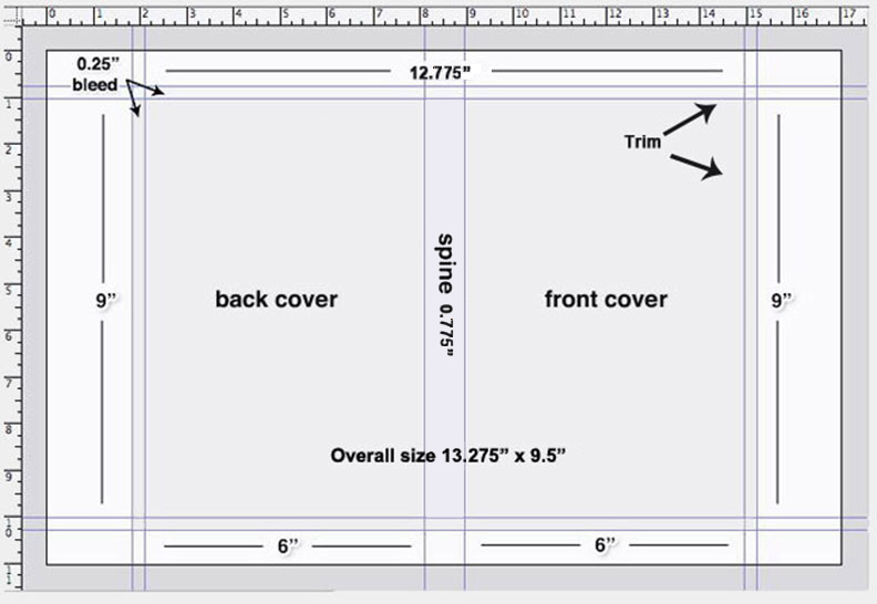
Click here to download PhotoShop template

  • Bleed: Any background color or photograph that extends to the edge of the page after trimming is called a bleed. To ensure ink coverage to the bleed edge, the image or background color must extend .25 inch beyond the trim. This area will be trimmed away after printing. Neither trim nor registration marks should be placed inside the bleed area.

  • Spine Width: To determine the book's spine size, divide the number of pages by the paper's thickness (measured in "pages per inch" or ppi). Our 50lb paper is 512 ppi, our 60lb paper is 465 ppi, our 70lb is 385 ppi our 80lb is 328 ppi. and our 100lb is 286 ppi (Example: 256 page book printed on 60lb would be 256 ÷ 465 = 0.55" spine.) For "safety", provide at least .0625" tolerance within the text on the spine. There can be no printing on a spine that is less than 0.25" (1/4").

  • Other papers:

  • 70lb Warm White is 377 ppi

  • 80lb Gloss Book = .0039 Caliper @ 512 ppi

  • 80lb Matte Book = .0046 Caliper @ 434 ppi

  • 100lb Gloss Book = .0047 Caliper @ 426 ppi

  • 100lb Matte Book = .0061 Caliper @ 328 ppi

Click here to download our Spine calculator

  • Spine Width and Variance: It is important to keep in mind that each book printed at Keystone is individually printed and bound. Therefore you should avoid hard vertical lines separating your front or back cover panels from your spine and should allow for at least a 0.125" variance of your spine on each side (for example, the text on a 1" spine should be no larger than 0.75" wide).

  • Color Breaks on the Spine: This involves a spine whose color is different from the color used on the front or back cover. We call this a "color break." Because the bulking of paper can vary slightly, it is inadvisable to create a color break between the spine and both the front and back covers. It is better to have only one color break, either on the front or the back.
    Another solution is to extend the spine color over onto the front and/or back cover by about 1/4 inch.

  • For best results text should be at least 0.25" from trim edges of the book.

  • If scanning to create the digital file, scan all images at 300 dpi CMYK.

  • Black elements should NOT be built in "Registration" black. These elements should be built out of "Rich" black. For best results, we recommend the CMYK values of 60% Cyan, 40% Magenta, 40% Yellow, and 100% Black. CMYK total value should not exceed 240%.

  • The barcode should be built in 100% Black only.

  • File Types Accepted:
    PSD, TIFF, JPEG, PDF, PNG and EPS

  • Laying Out Your Cover with Adobe® InDesign (Video)

    Some interesting book covers


On Proofreading...

And then there is that other thing: when you think you are reading proof, whereas you are merely reading your own mind; your statement of the thing is full of holes & vacancies but you don't know it, because you are filling them from your mind as you go along. Sometimes -- but not often enough -- the printer's proof-reader saves you -- & offends you -- with this cold sign in the margin: (?) & you search the passage & find that the insulter is right -- it doesn't say what you thought it did: the gas-fixtures are there, but you didn't light the jets.


―Sam Clemens Letter to Sir Walter Besant, 22 Feb. 1898


“I was working on the proof of one of my poems all the morning, and took out a comma. In the afternoon I put it back again.”


― Oscar Wilde


Proofreading means examining your text carefully to find and correct typographical errors and mistakes in grammar, style, and spelling. Here are some tips.

Accurate proofreading and clear marking of corrections are indispensable requisites to the production quality of a book. Proofreading is the sole responsibility of the author. No one else will proofread the typeset text.

Proofreading is a prerequisite for effective written communication. The grammar and spellchecker in some software catches only some mistakes. To catch other less obvious errors you need to visually proofread your document. Get others involved. Asking a friend or a Writing Lab tutor to read your manuscript will let you get another perspective on your writing and a fresh reader will be able to help you catch mistakes that you might have overlooked

  • Work from a printout, not the computer screen. (But see below for computer functions that can help you find some kinds of mistakes.)

  • Read out loud. This is especially helpful for spotting run-on sentences, but you'll also hear other problems that you may not see when reading silently.

  • Use a blank sheet of paper to cover up the lines below the one you're reading. This technique keeps you from skipping ahead of possible mistakes.

  • Use the search function of the computer to find mistakes you're likely to make. Search for "it," for instance, if you confuse "its" and "it's;" for "-ing" if dangling modifiers are a problem; for opening parentheses or quote marks if you tend to leave out the closing ones.

  • If you tend to make many mistakes, check separately for each kind of error, moving from the most to the least important, and following whatever technique works best for you to identify that kind of mistake.
    For instance, read through once (backwards, sentence by sentence) to check for fragments; read through again (forward) to be sure subjects and verbs agree, and again (perhaps using a computer search for "this," "it," and "they") to trace pronouns to antecedents.

  • End with a spelling check, using a computer spelling checker or reading backwards word by word.
    But remember that a spelling checker won't catch mistakes with homonyms (e.g., "they're," "their," "there") or certain typos (like "he" for "the").


Book Block Specifications

  • KD Press expects to receive print-ready manuscript and cover files, and will not perform work of an editorial nature such as proofreading, editing for content, typesetting, or making font alterations throughout a book. A digital file must be ‘print ready’ and sent in accordance with the digital file submission instructions provided–to ensure that no problems will be encountered during the manufacturing process. Files are processed as received and are not pre-flighted prior to processing.

    KD Press allows for a 1/16" (0.0625 in / 2 mm) variance for ALL books printed. Please keep this in consideration when designing any text and cover files.

  • PDF COMPLIANCE: Files must be PDF/X-1a:2001 or PDF/X-3:2002 compliant. The PDF/X-1a:2001 setting is found in the Professional versions of Adobe Acrobat 6 or above (listed as PDF/X-1a in Acrobat 6 Professional). The PDF/X-3:2002 setting is found in the Professional versions of Adobe Acrobat 7 or above.

    Some of the reasons this setting is the most efficient to use when creating PDF files for print:

    1. Requires all fonts to be embedded. With PDF/X-1a:2001 or PDF/X-3:2002: if a font cannot be embedded, the PDF file will fail to create (unless default preferences have been altered). This should immediately tell the creator that the first issue to check is fonts (and the log should list the reason). A common reason a font will not embed using PDF/X-1a:2001 or PDF/X-3:2002 is due to licensing restrictions with the font.

    2. Converts RGB images/page items to CMYK. This is a critical check. RGB is how monitors handle color, but it is not intended for printing. If a file is sent as RGB, and prints as is, the shift that it goes through during the rip process may be significant enough to cause the customer to be dissatisfied with the final output creating extra time and costs for the book to print satisfactorily. A CMYK file will result in a truer representation of the color BEFORE a file is submitted.

    3. Trapping settings will be corrected. This is an issue with how colors interact with each other that generally preview correctly on screen, but can cause a problem when the ink is printed on the paper.

    4. Transparency will be flattened (no live transparency). Layering/special effects such as drop shadows should be rendered correctly so that there are no unexpected results when a file goes through the rip process.

      Creating PDF files from various desktop programs.
  • Review your PDF file for accuracy

    This is a very important – yet often overlooked – step in the process. Please open and review your newly created PDF to insure that all elements are present and properly represented in your PDF prior to submitting it for printing. Incomplete or incorrect digital files will put your project behind schedule.

  • Microsoft Word: do not use the ‘shortcut’ button/icon in the tool-bar to create a PDF of your text file.
    Please use the ‘print’ menu: for instructions on how to do this, click here.

  • If book block is created as a Postscript (.ps) file, files should be created with a generic Adobe Postscript driver, and must be saved at a 600 dpi resolution.

  • If book block is created as a Postscript (.ps) file, files must be created using standard desktop publishing software to produce an Adobe PostScript Level 2 or Level 3 output file (using the setting "print to file").

  • Continuous tone photographs and artwork should be 8-bit gray-scale, at 300 dpi. Line art should be 1-bit black and white at 600 dpi.

  • All fonts should be embedded. PDF font subset should be set at 100%.

  • Margins: We require that all live text and graphic elements be at least 0.25" inside the trim. Many designers choose, to have a 0.75" inside margin with a 0.5" outside margin for text. Books with larger page counts (over 400 pages) should have larger inside margins to allow for margin lost during binding.

  • Interior text should be submitted as gray-scale only (e.g. do not submit as CMYK or RGB).

  • Text files must be submitted as a single PDF file, pages in numerical order (no printer spreads, i.e. page spreads).

  • The interior pages of your book are commonly referred to as your book block and should be formatted to the exact final trim size of your book. It should also be submitted as a single PDF file with one text page per PDF page. (eg a 6"x9" book block should be submitted as a 6"x9" PDF unless bleed is required.) KD Press will not scale a text file.

  • How to convert your Word file to PostScript file.


Copyright & Permissions

What Is a Copyright?

U.S. copyright law grants creators property protection for "original works of authorship." When you decide to use material copyrighted by others in your manuscript, it is your responsibility to obtain permission to use that material.

A manuscript is protected by copyright from the time of its creation. Currently, the term of a copyright in works created after January 1, 1978, other than works made for hire, endures for 70 years following the death of the last surviving author. Copyright in a work made for hire endures for 95 years from publication or 120 years from creation, whichever is shorter. Works published prior to January 1, 1978, have an original term of 28 years and a 47-year renewal term, totaling 75 years. Public Law 105-298, enacted on October 27, 1998, further extended the renewal term of copyrights still subsisting on that date by an additional 20 years, providing for a renewal term of 67 years and a total term of protection of 95 years.

Permission Requirements

Permission is the authorization to make a copy of material protected by copyright. These guidelines apply to any works under copyright, whether that source material is old or recent, in print or electronic form, and whether you change from one format or media to another.

Material That Requires Permission
You should always secure permission for the following:

  • single quotations or several shorter quotes from a full-length book (more than 300 words in total)

  • single quotations from a newspaper, magazine, or journal (more than 50 words)

  • artwork, photographs, or forms, whether or not from a published source (sometimes more than one permission is required for a photograph, e.g., one from the photographer and one from the creator of the underlying work shown in the photograph)

  • charts, tables, graphs, and other representations where, inevitably, you are using the entire representation (the copyrighted features are complete in themselves and inherent in the whole work)

  • material that includes all or part of a poem or song lyric (even as little as one line), or the title of a song

  • computer representations, such as the depiction of results of research on computerized databases, the on-screen output of software, reproduction of web pages or programming, the capture of Internet or other online screen shots (note that if a web site invites or authorizes copying, or specifies that it is "open source," and there is no notice indicating that it contains material original to others and is therefore under copyright, then you do not need to get permission)

  • any third-party software to be distributed as an electronic component with your work

  • clearances, including permissions for the use of trademarks and releases from privacy claims

Material That Does Not Require Permission

Copyright does not prevent the use of facts or ideas, but does protect the author's expression. Even when material is protected by copyright, there are situations where permission to reproduce is not required.

Fair Use

Fair use is a legal concept that allows the use of copyrighted material without the need to obtain permission from the copyright owner for purposes such as criticism, comment, news reporting, teaching, scholarship, or research under the law. This is a fact-based determination on a case-by-case basis, with the following four factors to be considered:

  • the purpose and character of the use of material from a copyrighted work

  • the nature of the copied work

  • the amount and substantiality of the material used in relation to the entirety of the original copyrighted work

  • the effect of the use upon the potential market for or value of the copyrighted work

If you are in doubt about whether your use of copyrighted material is a fair use, request permission. Even if your use constitutes fair use, and you do not have to obtain permission, you should give proper credit to the original source.

Interviews

Generally, you can use material from any interview you conduct, including direct quotes, without securing a signed release if the circumstances and your notes clearly reveal that the source knew you were conducting an interview for possible publication and did not indicate intent to restrict your use of the material. Otherwise, ask the interviewee to sign a release.

Facts, Information, and Ideas

Generally, you may use facts you obtain from another work. However, note that copyright encompasses the format, organization, sequence, and style of presentation, as well as the sense or feeling of the original. When paraphrasing, even if you do not have to request permission, always give credit to the original source.

Public Domain

You do not need to obtain permission for materials that are in the "public domain." This includes all official U.S. government publications, as well as any materials for which the copyright has expired.


History of Paper

Besides steel, there is likely no more influential material in humankind’s existence than paper. If you try to imagine a world without paper, it’s difficult. Of course, you may immediately think of office production grinding to a halt, however, think more existentially – no paper towels to clean up messes, no lottery tickets at the convenience store, no birthday cards for your kids, no sticky notes reminding you to take out the trash. So much of our daily lives revolve around the use of paper that when you think about how its existence and versatility has impacted everyday life – it’s nearly impossible to conceive of a world without it.

The word paper comes from the ancient Egyptian writing material called papyrus, which was woven from papyrus plants. Papyrus was produced as early as 3000 BCE in Egypt, and in ancient Greece and Rome. Further north, parchment or vellum, made of processed sheepskin or calfskin, replaced papyrus, as the papyrus plant requires subtropical conditions to grow. In China, documents were ordinarily written on bamboo, making them heavy and awkward to transport. Silk was sometimes used but was normally too expensive to consider. Indeed, most of the above materials were rare and costly.

book printing

Invention of Modern Paper

The Chinese court official Ts’ai Lun is credited with describing the modern method of papermaking in 105 AD with other sources trace the invention of this type of papermaking to China in 150 BCE. The technology then transferred to Korea in 600 and then imported to Japan around 610 by a Buddhist priest, Dam Jing from Goguryeo, where fibres (called bast) from the mulberry tree were used.

Papermaking Technology

After further commercial trading, the invention spread to the Middle East, where it was adopted in India and subsequently in Italy in about the 13th century. In these instances, they used hemp and linen rags as a source of fiber.

Some historians speculate that paper was the key element in global cultural advancement. According to this theory, Chinese culture was less developed than the West in ancient times because bamboo, while abundant, was a clumsier writing material than papyrus. Chinese culture advanced during the Han Dynasty and preceding centuries due to the invention of paper; and Europe advanced during the Renaissance due to the introduction of paper and the printing press.

The Modern Papermaking Process

Paper remained a luxury item through the centuries, until the advent of steam-driven papermaking machines in the 19th century, which could make paper with fibres from wood pulp. In 1807, the Fourdrinier papermaking machine was patented in France. This machine, considered to be the basis of most modern papermaking worked by a continuous process: pulp was fed onto a belt of wire cloth that was continually moving, so that the sheet was smoothed on rotating heated cylinders and onto a reel.

This was cut up into the appropriate length of sheets, which were then traditionally counted into reams. The Fourdrinier brothers were able to increase their production of paper ten-fold, from 60 to 100 lbs. per day by hand, to 1,000 lbs. per day using their new machine. Fifty years after the mechanization of the process, the price of paper had dropped by almost one half.

Together with the invention of the practical fountain pen and the mass-produced pencil of the same period, and in conjunction with the advent of the steam-driven rotary printing press, wood-based paper caused a major transformation of the 19th-century economy and society in industrialized countries.p

With the gradual introduction of cheap paper, school books, fiction, non-fiction, and newspapers became slowly available to nearly all members of society. Cheap wood-based paper also meant that keeping personal diaries or writing letters ceased to be reserved to a privileged few. The office worker or the white-collar worker was slowly born of this transformation, which can be considered as a part of the industrial revolution.


The effect of light in darkening a prepared paper was discovered by Thomas Wedgwood in 1802.[1] Photographic papers have been used since the beginning of all negative–positive photographic processes as developed and popularized by William Fox Talbot (Great Britain/1841-calotype).

After the early days of photography, papers have been manufactured on a large scale with improved consistency and greater light sensitivity.

Take a look at some of Bodine's Photographsthe bayBodine


Why Self-Published Books Look Self-Published

by Joel Friedlander

If you’ve looked at a lot of self-published books, you already know that authors sometimes go to press before they have really absorbed all the conventions of book making and the advice of publishing professionals.

In fact it surprises authors—who haven’t noticed the mistakes that creep into their books—that these same mistakes are quite obvious to people in the book business. Since they didn’t notice the errors, they’re surprised when other people point them out.

Judging Books Reveals Problems

Recently I had the opportunity to act as a judge for the annual BAIPA Book Awards.

Many of the books in the competition were produced by independent pressses who have professional book people on staff or hire them for specific projects and, of course, those books look just the way they are supposed to look.

There were also quite a few self-published books, and among those there was a lot of variation in how well they were put together.

One thing that distinguishes the BAIPA awards is that the participants receive the actual judging forms that we filled out, with all the comments included.

One of the authors whose book I judged wrote to me recently. She asked me to explain the remarks on her judging form.

I wondered whether she knew that I was the author of the comments, which were submitted without identification. I don’t know, but I’d bet that she made an educated guess before she wrote to me. Authors are a pretty clever bunch, aren’t they?

I told her I would be happy to explain, and that it would help more authors if she would allow me to do this on my blog. With her agreement, here is her query and my responses.

The Point of the Criticism

Here’s a section from the author’s note to me:

“The criticism I received for the layout of my novel … included the following:
‘No category or price, no Bookland/EAN barcode, although there is, oddly, a UPC on the book.’
I don’t know what these words mean. Also, objections were made to widows/orphans (which I had thought acceptable) and ‘no running heads, hyphenation is nonexistent, leading to the suspicion this book was produced on a word processor’ What is a running head? Do words have to be hyphenated at margins? What’s wrong with word processing production?”

That’s fair enough: if you don’t know the terminonlogy being used, you can’t be expected to understand the criticism, no matter how well-intentioned.

Let’s disassemble this inquiry and look at the parts:

  • No category or price.”
    It’s considered standard practice to print a category on the back cover of your book, and if you think about it, that makes a lot of sense. Book retailers, book buyers and bookstore staff need to know where your book belongs, and the more information you give them, the easier it will be for them to put it in the place where it’s most likely to be found by the right people. Putting a category on the book is the lowest level of metadata and should be done for all books. Likewise, a print book that a prospective buyer can pick up to examine ought to have a “human readable” retail price on it.

  • No Bookland/EAN barcode although there is, oddly a UPC on the book.”
    Throughout the book industry we identify books by their International Standard Book Number (nd this is the most basic identifier for the specific retail product. Since we live in an age of electronic scanners, the way the ISBN is usually displayed on the back cover of a book is with a scannable form: a barcode. And the standard format for book ISBNs is the Bookland/EAN barcode. It’s the one you usually see on books. This book did not have one but, instead had the UPC barcode that you typically find on clothing, food and other retail items.

  • Widows, orphans.”
    Widows and orphans are typographers terms for short bits of sentences that appear by themselves at the top of a page, or a single line that starts a paragraph that appears by itself at the bottom of a page. In some styles of book design these are left in the book, but in others we try to eliminate them. You can tell which style is being used, and in this book the widows and orphans were particularly bad-looking, and sometimes you would see just a word or two at the top of the page, which I think is unsightly.

  • No running heads.”
    This refers to the title, author’s name, chapter title or other information that appears at the top (usually) of standard text pages. Although there have always been books that didn’t use running heads (or running feet if they are at the bottom of the page), they are so common that we only notice them when they are missing. Running heads are a basic navigation tool supplied to readers so they can tell where they are in the book. Without them, your pages may look “undressed.

  • Hyphenation is nonexistent.”
    You can produce a book with hyphenation or without it. Since lines are justified by adding space between words, books that don’t use hyphenation have much worse inter-word spacing, usually leading to “rivers” of white space on the page. This is distracting to the reader and can make it more difficult to take in what the author is saying. In fact, it’s the ability to produce sophisticated hyphenation and justification that gives books produced with professional-grade tools by a competent designer the “look and feel” of real books.

  • “…leading to the suspicion this book was produced on a word processor.”
    Okay, well, I’m not going to pretend that no book should be produced with Word or another word processor, because plenty of them are being done that way. But in this competition we were asked to judge the books against a professional standard, and books created with word processors face serious handicaps in meeting that standard. Poor font handling, lack of hyphenation, crude justification are the results. Word processors that are designed for letters, memos, business reports and the like are simply not up to the task of creating beautiful and pro-level book typography.

Expectations and Goals in Self-Publishing

As I’ve often said, how you produce and market your books depends entirely on the goals you’ve set for the book. A large part of my Self-Publishing Roadmap training course is devoted to exploring how your production and publication strategies play out depending on the aims you have for your book.

For books you’re experimenting with, for early drafts, books for peer review, or for private circulation or as an expression of a hobby, a book like this one is perfectly fine.

But if you want more, if you expect buyers, reviewers, readers and awards judges to respond favorably to your book when comparing it to books that may have come from traditional publishers or from authors who have put together a team of professionals to create their books, it’s simply not good enough.

So what’s the message for authors? Be clear about what you expect, and create the book that will fulfill your goals. Both you and your readers will be happier for it.


It's true that you can't please all of the people all of the time. But you can usually please some of the people, some of the time. But more importantly, you should always strive to please yourself whenever possible.


Get in touch!

Address: 37 Industrial Blvd., Paoli, PA 19301
Telephone: 484-318-7017
Fax: 484-320-8743

Email: sales@kdpress.com