Image Resolution
Pixel Basics
Pixels are the building blocks of an image. Every digital image, whether it is a graphic or a photograph, is made up of thousands or even millions of individual pixels. The more pixels contained within an image results in greater detail and quality.
The number of pixels makes a huge difference in quality!
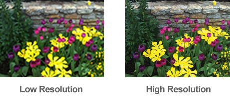
Image Resolution for Your Print Job
It is important to note that a low-resolution image cannot be made into a high-resolution image. There is no way to add pixels to improve the quality of an image, so when working with images, the higher the quality the better – especially if you are in doubt.
The most important element to consider when printing your image, or images, is how large you can print an image while still maintaining quality and detail. PPI (pixels per inch) refers to the pixels contained in a digital image. DPI (dots per inch) refers to the number/density of ink dots printed by a press.
SMALL FORMAT: For small format jobs such as brochures or booklets, it is recommended that images for print be saved at 300ppi, as this will help achieve a high-quality print. To calculate the desired file size, multiply the final printed size of the image in inches x 300. For example, if an image is 4” x 6″ on the printed page, 4×300 by 6×300 = 1200 x 1800 resolution.
LARGE FORMAT: Large format jobs, such as banners and signs have a little more flexibility when it comes to resolution, so line images that are 200ppi will work for large format. For photographic images on canvas, 100ppi is considered adequate.
Using Photoshop to See Image Size
Graphic-editing software such as Photoshop will almost always measure an image’s resolution via pixel dimension. To see what your image dimension is, go to Image > Image Size.
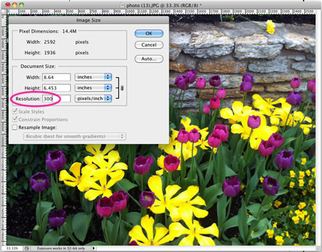
This image can be printed up to about 8.5 X 6.5″ at 300 PPI.
Borders on Artwork
Considering bleeds and borders, first start designing with a minimum safety margin of .125″. If you add a border to your artwork, however, it is essential that your safety margin instead be .25″ to maintain border consistency on all sides. Border thickness is important because if it is too thin, the border may look uneven after cutting, but the thicker the border, the better the results. Cutting tolerance is .0625″. For smaller pieces, the shift in cutting tolerance will be more likely and more noticeable.
What is a Bleed?
A bleed is printing that goes beyond the edge of the sheet after trimming. It is part of the background that will be trimmed off after the file is printed and cut down to the finished size. As such, the bleed is an area where the document image is extended from one side of the paper to another without critical information in it. If a bleed is not included in the document set up, there is a good chance that there will be a gap between the edge of the printed area and the cut line. This happens because there is a tolerance when cutting the printed piece.
Bleed Size
It’s pretty easy to set up bleeds in the major design programs. Bleeds of 1/8” are required on anything small like business cards, flyers, brochures, sell sheets, newsletters, or booklets. For larger items such as signs, posters, and tradeshow graphics, bleeds of 1/4″ are needed.
Important Page Setup Information
Bleeds and Crop Marks
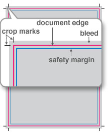
Crop marks need to be included on all four corners of the document. The bleed on this 8.5 x 11″ document is .125″. The edge of the document is shown with the pink outline (please do not include this in actual file). There is a safety margin shown in blue. It is .125″ from the edge of the document. It is important that there is no information outside the safety margin.
Correct Document Setup
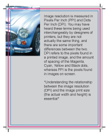
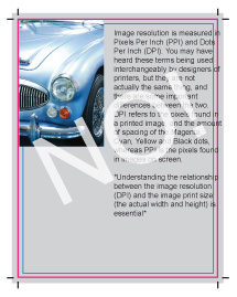
This is an example of a document that is set up correctly, and none of the important information will be trimmed off. The image goes to the edge of the bleed, and all the text is positioned in the safety margin.
Incorrect Document Setup
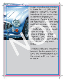
This example is not set up correctly. The image does not go to the edge of the bleed, and therefore there might be a blank line on the edge of the printed piece. The text is going into the bleed area which will cause it to be trimmed off and unreadable. It is crucial that important information stays inside of the safety margin.
Incorrect Document Setup
The image is set up correctly in this example because it is going to the edge of the bleed. However, the text is outside of the safety margin. Some of it will most likely be trimmed off.
Bleed Setup in Illustrator

Bleed Setup in InDesign
When creating a new document, to get to the Bleed options, you have to expand the Bleed and Slug section.
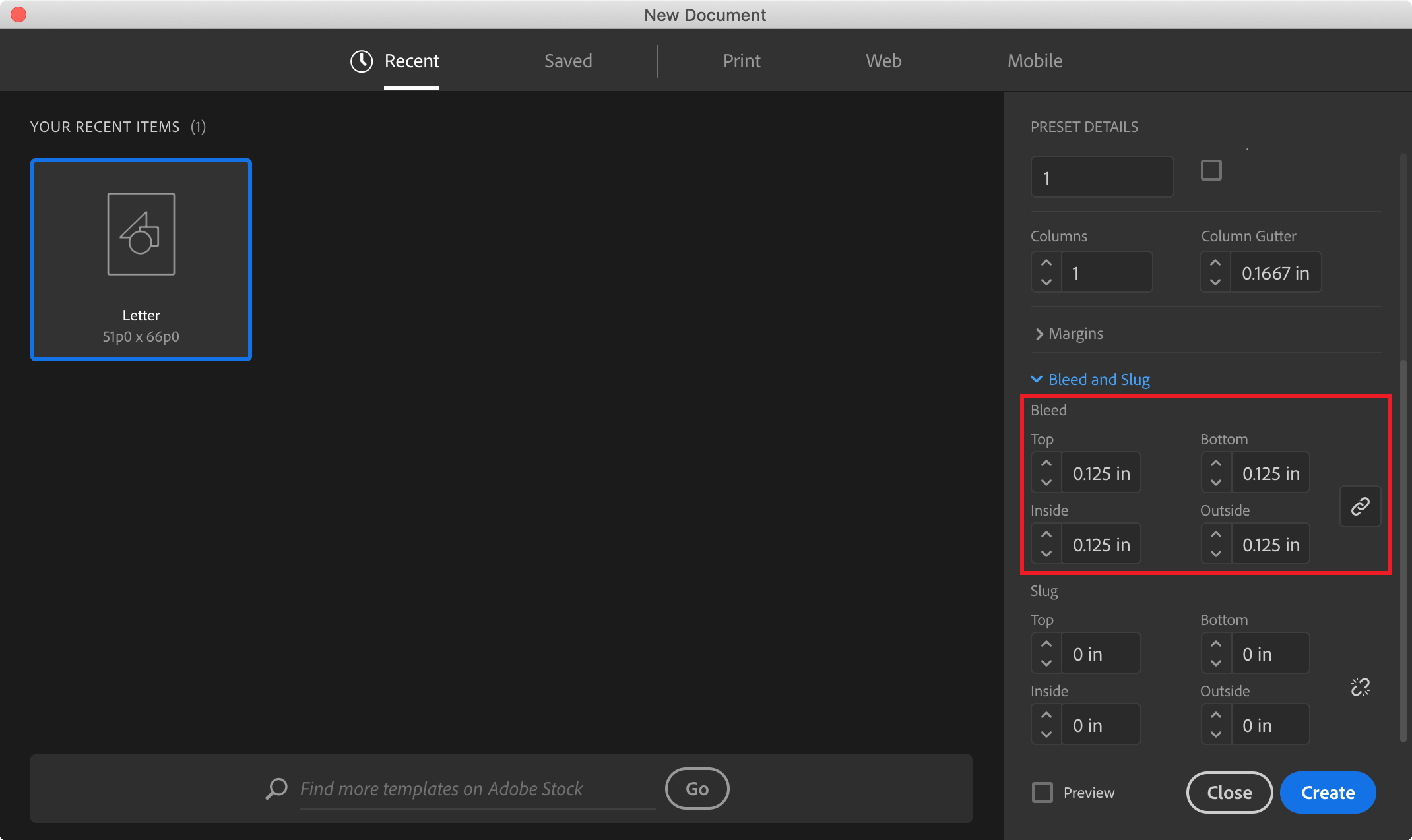
Optional: InDesign defaults to picas. If you type in “.125in” (the “in” for inches is very important), it will calculate that measurement in picas. If you would prefer to work in inches, another solution is to go to Preferences > General > Units & Increments. In the Ruler Units block, the Horizontal and Vertical should have the Inches option selected.
Bleed Setup in Photoshop
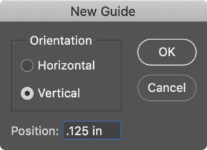
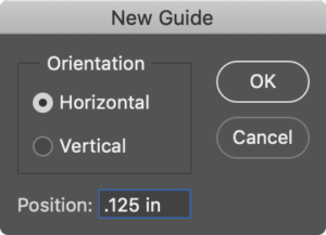
Setting up the correct document size takes a little bit of math. Unlike InDesign, there is not a default bleed setting. For example, let’s say you would like to create an 8.5 x 11″ document. There will need to be a bleed of 1/8″ on all four sides of the document. Therefore, the document size will need to be 8.75 X 11.25″ in size.
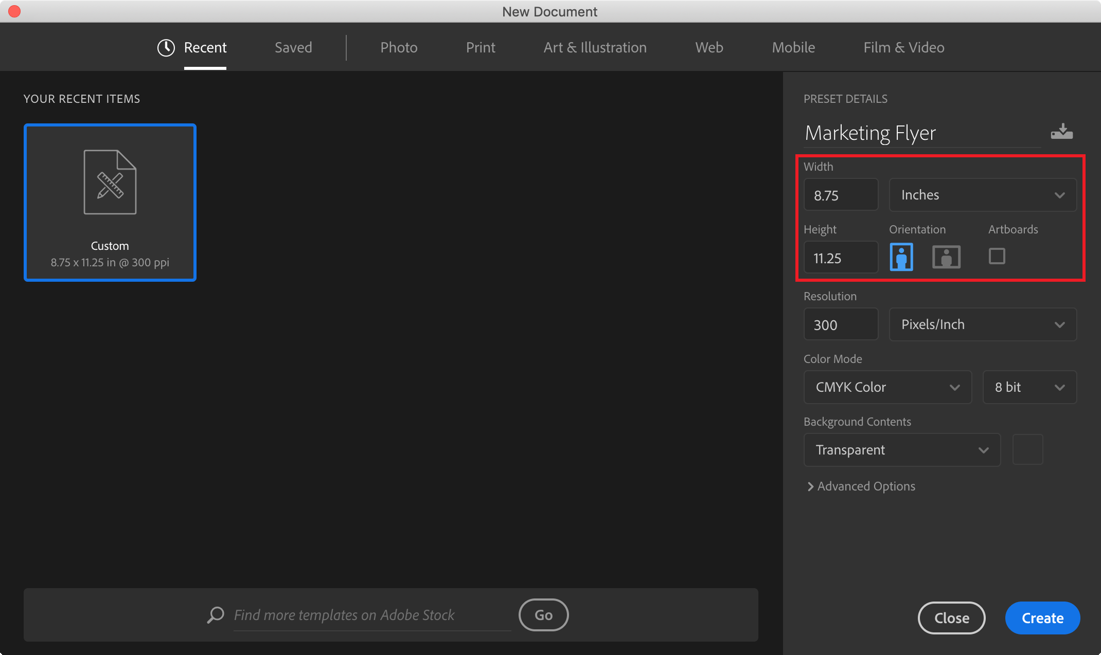
It is helpful to have guides for showing the actual product dimensions: go to View > New Guide.
Color
Keystone uses a CMYK digital printing process, which means our presses print a wide range of hues using cyan, magenta, yellow and black inks. We will reproduce color from submitted print-ready files as closely as possible, but even under the best circumstances, an exact color match is not possible. As a result Pantone color matching is not a Smartpress offering. If you specify a spot color in a document, however, we will simulate that color using CMYK ink to match the color as closely as possible. This is an inherent limitation in the printing process. The term “color match” refers to the color rendering intent specified in the submitted artwork. If you specify a spot color in a document, however, we will simulate that color using CMYK ink. The match will be as close as our printing equipment can get, but it will never be as perfect as using a real spot color.
Please note: Many bright or very dense colors cannot be matched very well at all. In these cases, we will print the next closest color our equipment can produce.
Pantone® Colors
Pantone colors are the most common type of spot color. Each color has a number which is its name. For example, if you were to choose Pantone 286 C for an element in your artwork, this identifies an exact color (a very nice deep blue). You can get a Pantone color guide, and see for yourself exactly what this color is supposed to look like. That is what makes named spot colors so valuable.
Spot Color Overview
Spot Colors were invented for the world of lithographic printing, where ink was specially mixed to create specific colors. If you print with a spot color on a litho press, you are actually putting a special color of ink on the printing press to produce that very precise color. In some programs, such as Adobe or Quark products, it is possible to choose spot colors. A spot color is a named color that is treated individually in the printing process. Most color in your document is specified as a formula, either as CMYK, RGB, or LAB. Spot Colors, however, are specified by name.
Spot colors are expensive, however. For this reason, most printing is done using a combination of Cyan, Magenta, Yellow, and Black ink on a four-color press. Those four colors in combination produce the vast array of color you see on a printed page.
You would think that if you mixed those four colors just right, you could reproduce any spot color. This is true for most spot colors – but not all of them. For example, fluorescent colors are too bright to print with CMYK inks. Other spot colors have special properties that cannot be reproduced with standard inks, such as metallic-looking colors.
Spot Color Matching
Keystone does not offer spot color printing except by special arrangement. If you specify a spot color in a document, however, we will simulate that color using CMYK ink. The match will be as close as our printing equipment can get, but it will never be as perfect as using a real spot color. Also, many bright or very dense colors cannot be matched very well at all. In these cases, we will print the next closest color our equipment can produce.
If your job is highly color critical, we recommend ordering a hard proof. That way you will know what kind of color you can expect from your artwork.
If you have any questions, do not hesitate to call us: 484-318-7017, or fill out our contact form.
PDF Files
While printers can work with files from many design applications it is best to provide your printing partner a press quality PDF. A PDF is the preferred format because it packages all the components of your file including fonts, color information and other important settings while still allowing the printer flexibility to make modifications to the file and prep it for printing.
Many programs provide several methods to make a pdf file (printing to a pdf driver, saving a file as a pdf and exporting the file as a pdf). Below is a list of how to convert a file to pdf document in some of the more popular programs. Regardless of the method chosen, a press quality pdf should be the result.
InDesign
1. Choose File > Export.
2. Specify a name and location for the file.
3. For “Save As Type” (Windows) or “Format” (Mac OS), choose “Adobe PDF”, and then click Save.
4. Choose Adobe PDF Preset “Press Quality”
5. Then select the following options: Under “Marks and Bleeds” select a. crop marks b. bleed (.125”)
6. Click Export (Windows) or Save (Mac OS).
Illustrator
1. Choose File > Save As or File > Save A Copy
2. Specify a name and location for the file.
3. Choose Adobe PDF (*.PDF) as the file format and click Save
4. Choose Adobe PDF Preset “Press Quality”
5. Then select the following options: Under “Marks and Bleeds” select a. crop marks b. bleed (.125”)
6. Click Export (Windows) or Save (Mac OS).
Photoshop
1. Choose File > Save As, and then choose Photoshop PDF from the Format menu.
2. Click Save. In the Save Adobe PDF dialog box, choose an Adobe PDF preset specifying whether the Photoshop file will be printed on a desktop printer or proofer, sent to a commercial printer, distributed by email, displayed on the web, and so on. For details, see Adobe PDF presets.
3. Choose Adobe PDF Preset “Press Quality”
4. Click Export (Windows) or Save (Mac OS).
Microsoft PowerPoint
1. First, make sure your slide is designed to the correct size for printing.
2. Go to “Design” > “Slide Size” > “Custom Slide Size”.
3. Save the files as pdf.
Microsoft Word - MAC
1. Choose File menu, click Print, and then click Save As PDF.
2. In the Save As box, type a name for the file.
3. Locate the folder and disk where you want to save the file, and then click Save.
Microsoft Word - PC
1. Choose File Print
2. Select “Adobe PDF” as the printer
3. Under Properties
4. Select: “Press Quality” for Default Setting
5. Uncheck “Rely on system fonts only; do not use document fonts”
6. Select the appropriate size
Providing a press quality pdf will help to ensure that your final product will turn out just as you expect. If you have any questions, please don't hesitate to contact us.
